- summary -
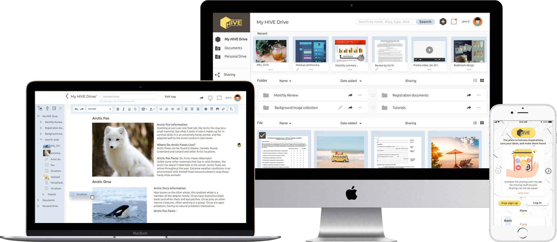
Although there are many cloud storage services in the market, there are still customer needs that are not 100% satisfied. This is where HIVE steps in.
As a lightweight personal cloud storage application, it aims at providing versatile storing and sharing solutions to the group of people who are creative, collaborative, and have a fast-paced lifestyle.
- UX design
- Visual design
- Branding
- User research
- Competitive analysis
- User flow
- Wireframe
- Prototype
- Usability testing
- Pen & paper
- Balsamiq
- Sketch
- InVision
- Usability Hub
problems
- Content creating feature is complicated to use.
- It is difficult to collect, save and organize web content.
- Sharing multiple documents at the same time is tedious.
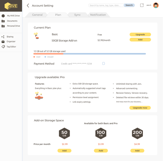
- Pricing for features and storages are not flexible.
solutions
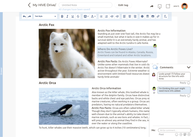
- Provide a note-taking tool for a quick and easy editing experience.
- Drag web content to the browser icon to save them.
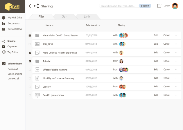
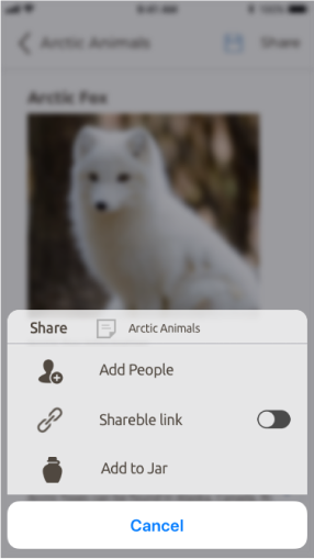
- Introduce a virtual container, Jar, for sharing multiple items without moving to the same folder.
- Separate purchase plan of add-on storage space.
- exploration -
competitive analysis
There were two categories of competitors put under the microscope for the competitive analysis. One is general storage services such as DropBox, Google Drive and Box; the other focuses on note-taking, EverNote.




By analyzing the competitors’ strength and weakness, it was discovered that even with these big names in the market there are still needs for an application that integrates quick note-taking feature with cloud storage functionality. Also, the fact that sharing, although is made easier using links than through emails, is still limited to the single element sharing across the market. A feature that enables a more flexible sharing method could make our product stand out based on users’ growing needs for online collaborations.
user research
Bearing the assumptions from the competitive analysis, I conducted a user survey to find out their goals, attitudes, and more importantly, complains of using the cloud storage service.
93% Users use cloud storage services
Upgraded to paid plan for extra features.
Shared files are text-based
What do you mainly use it for?
backup device 50%
share file across platforms 60%
collaborate 59%
What are your biggest complains about the current products?
app interface 61%
creating files 32%
organizing files 21%
What are your most desired features?
real-time editing 87%
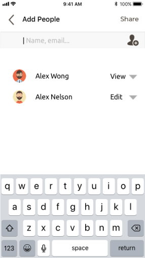
assigning permission level 74%
syncing local folders 71%
searching with tags 67%
comment notification 67%
personas
 Elie, 34 Y.O. Marketing Specialist
The Creative Team Player
“I’m just greatful the limited sized email attachment is not the only way of sharing files.”
Bio
Elise works for an international advertisement company, where she closely collaborates with her teammates at work and really enjoys that. Since her company has offices globally and collaborate on lots of the projects, she always finds herself revising marketing campaign materials, getting feedback and collecting requirements on the go. She loves that she can store everything online and share them using her phone, pc or tablet.
Motivation
- Shares all the marketing materials with teammates.
- Have access to files on the go and out of the office.
Goals
- Work on the same document with remote teammates at the same time.
Frustration
- Uploading files and creating folders to organize them are not as easy as sharing them.
- Sometimes the comments/feedback are missed when working on multiple projects.
 Norman, 21 Y.O. Student
The Multi-Device Notetaker
“I would love cloud storage more if organizing files can be as easy as in my OS.”
Bio
Norman is studying psychology in university and working toward his goal of having his own clinic. He participated in several research projects which requires a lot of reading, writing and information collecting. Cloud storage helps him keep all the articles and notes available whenever he needs them on the lab computer or even his mobile phone. He noticed he's running out of storage space but doesn't like the monthly subscription idea of buying online storage space.
Motivation
- Backup devices
- Store files to use on the lab computer and make space on pc and mobile.
Goals
- An easier way to organize and search for files.
- Files created are synced automatically.
- Have access to my files even when I'm not using my own device.
Frustration
- Need one place to take note, save and share them.
- The website interface is not as pleasant to use as the app.
- ideation -
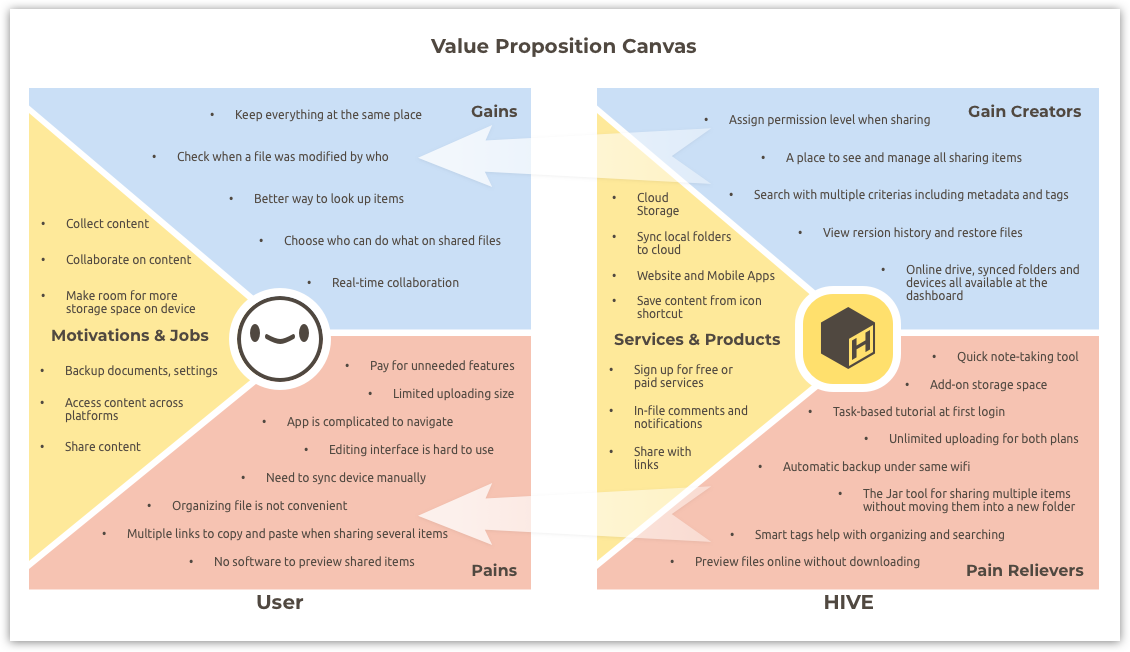
With plenty information collected on users’ problems and desires, I used the value proposition canvas to map the product features to users pains and gains as a guidance in developing the user stories and determining our MVP.
user stories
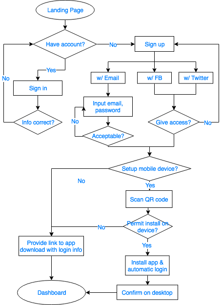
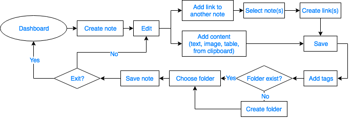
The importance level of the user stories was determined following the 80/20 rule. Then the user stories of high importance and several of medium importance were converted into user flows to illustrate how users would interact with the app to accomplish the tasks.
view all user storiesuser flows
 on-boarding
 create notes
 manage sharing items
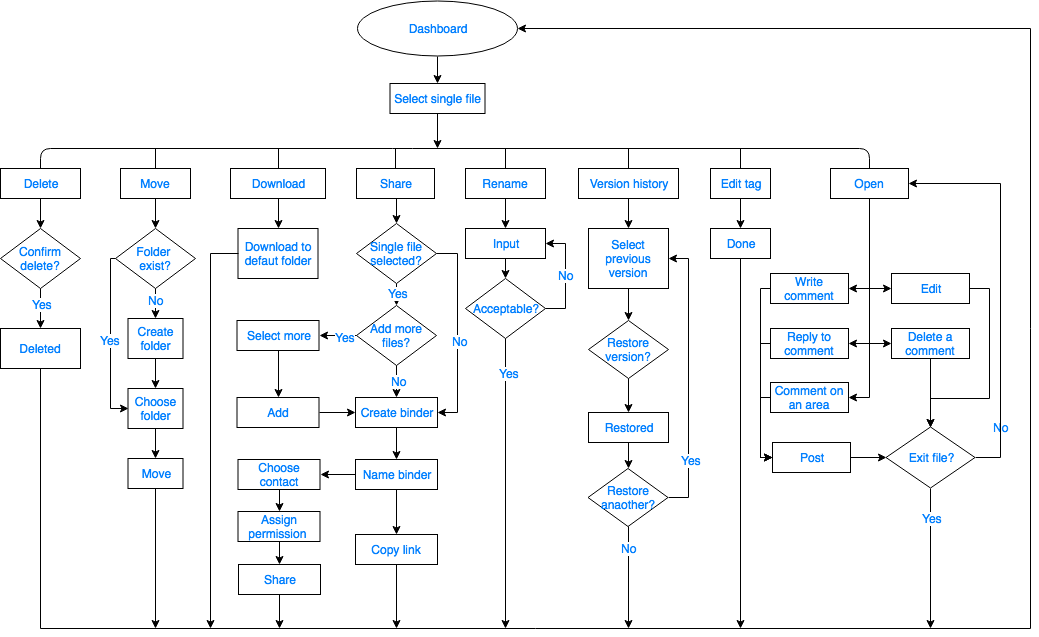 single file
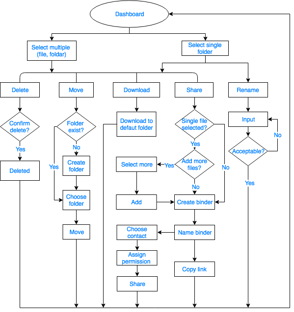 multiple file
wireframes
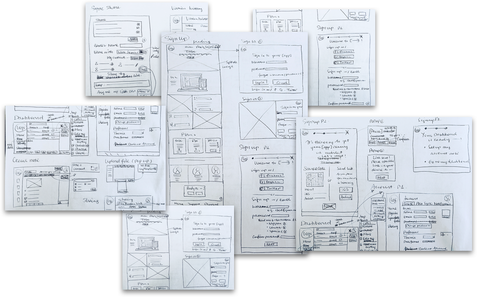
After sketching out the wireframes for these user flows, I used Balsamiq to create low fidelity wireframes for usability testing. The focus in this step is onboarding process and dashboard navigation. Some valuable feedback was collected regarding the order of the signup steps and the layout of the note editing screen:
“I prefer to get to the dashboard right away instead of setting up my account now.”
“I don’t think I need this menu here and it’s taking up the editing space.”
“I’m not sure if my note is saved or not.”
“How do I go back to the dashboard?”
By analyzing the issues users came across during testing, I simplified the signup process and improved the affordance layout of the editing screen. Additionally, from my observation, I also noticed that almost all users preferred to move things by dragging, like an instinct. So it inspired me to add a feature for users to edit content by dragging too. And it eventually became the Drawer tool that users liked a lot in the later usability testing.
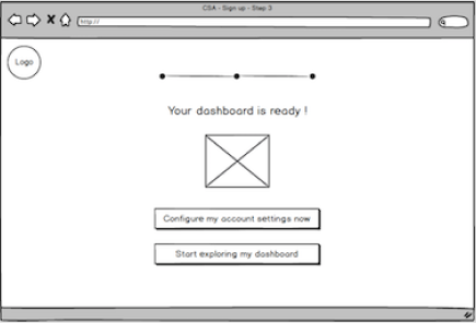
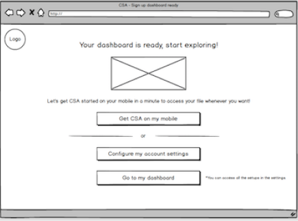
E.g.1 Provide instructions for user to setup mobile device.
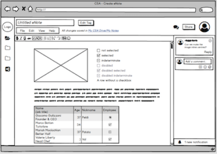
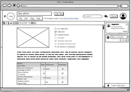
E.g.2 Remove the menu side bar for more editing space.
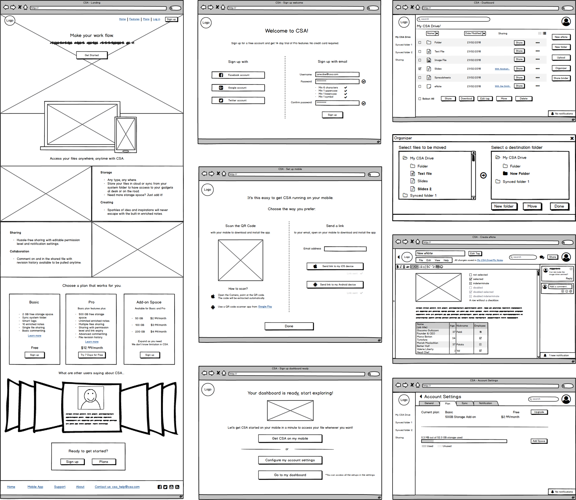 web app wireframes
 mobile app wireframes
- branding -
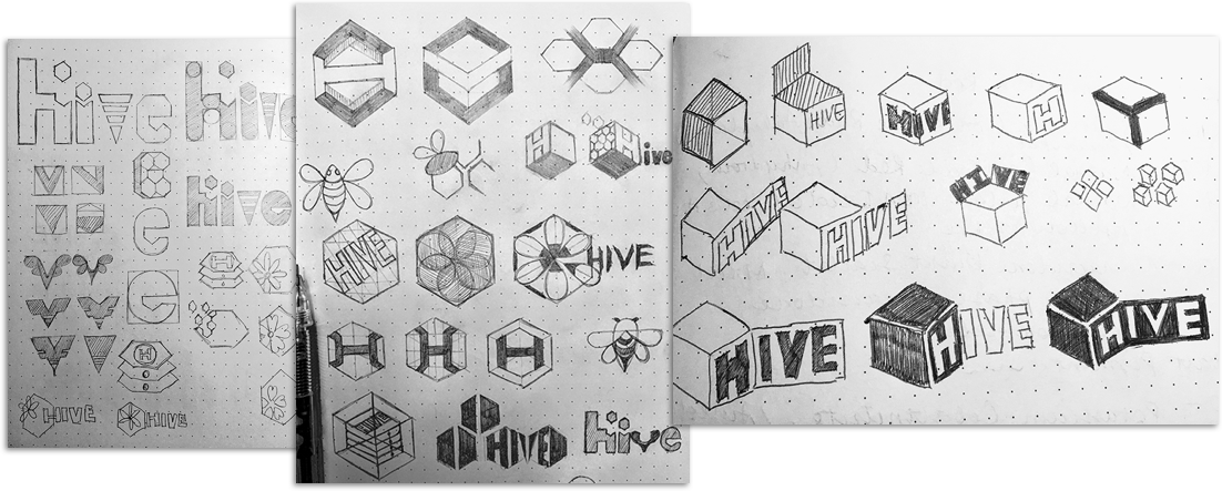
Now it’s time to add a theme to the black and white. Again I looked back at my research data for inspirations. According to the personas my target audience is a group of people who are creative, achieving, collaborative, and with a fast-paced lifestyle. By emphasizing the emotions and feelings I want the product to convey to the audience, I created a moodboard and sketched out several versions of the logo.
Logo Sketch
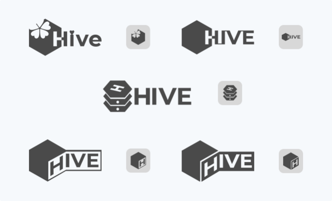
A/B Testing
style guide
The colour palette is based on the moodboard and was tuned for better contrast and visibility.
Montserrat is used for headers and Ubuntu for body.
Both are san serif with a large x-height to ensure good legibility on both desktop and mobile devices. They also support multiple languages that are also useful for a content collection and sharing platform.
- prototyping -
&
- testing -
Using Sketch, several main screens were mocked up, then connected into clickable prototypes for usability testing in InVision and UsabilityHub.
With this first version of the prototype, I conducted several remote, in-person and online testing, where the user was asked to do three tasks:
- Sign-up then get to the dashboard.
- Create a Note and add content.
- Create a Jar then share it.
After a few sets of the testing I collected some very valuable feedback and iterated on several main aspects:
- Most users didn’t notice that the setup mobile step can be skipped.
Frustration was observed because users went through the process thinking it was a required step for the first-time login, while trying to get to the dashboard right away. The problem was that the affordance for skipping the step and the information of this setup can be done later was not provided clearly.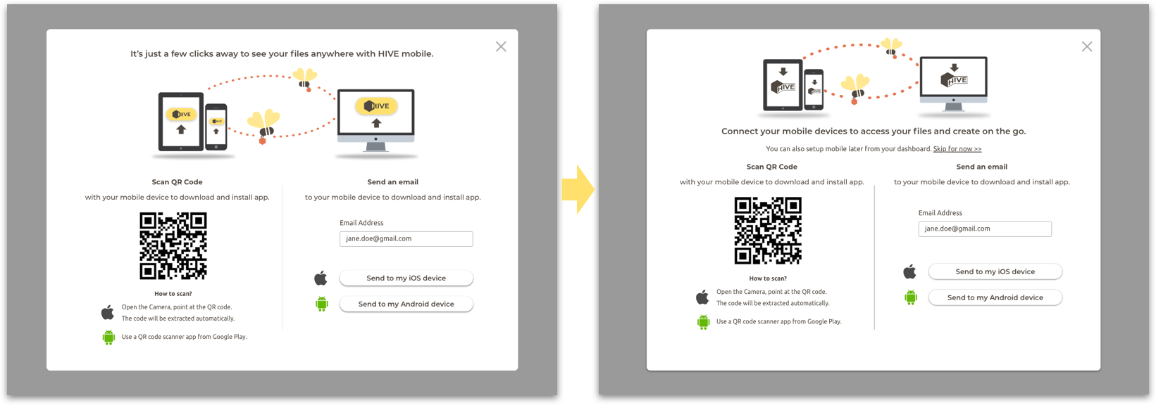 Before After
 - Users were confused on some CTA buttons.
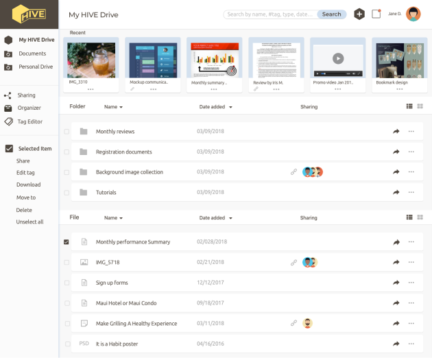
From my observation and the clicking heatmap, I noticed that users had trouble identifying some CTA buttons on the dashboard for creating new documents because of the colour and size of the icon. Consistency is very important for users to navigate the app interface without any confusions.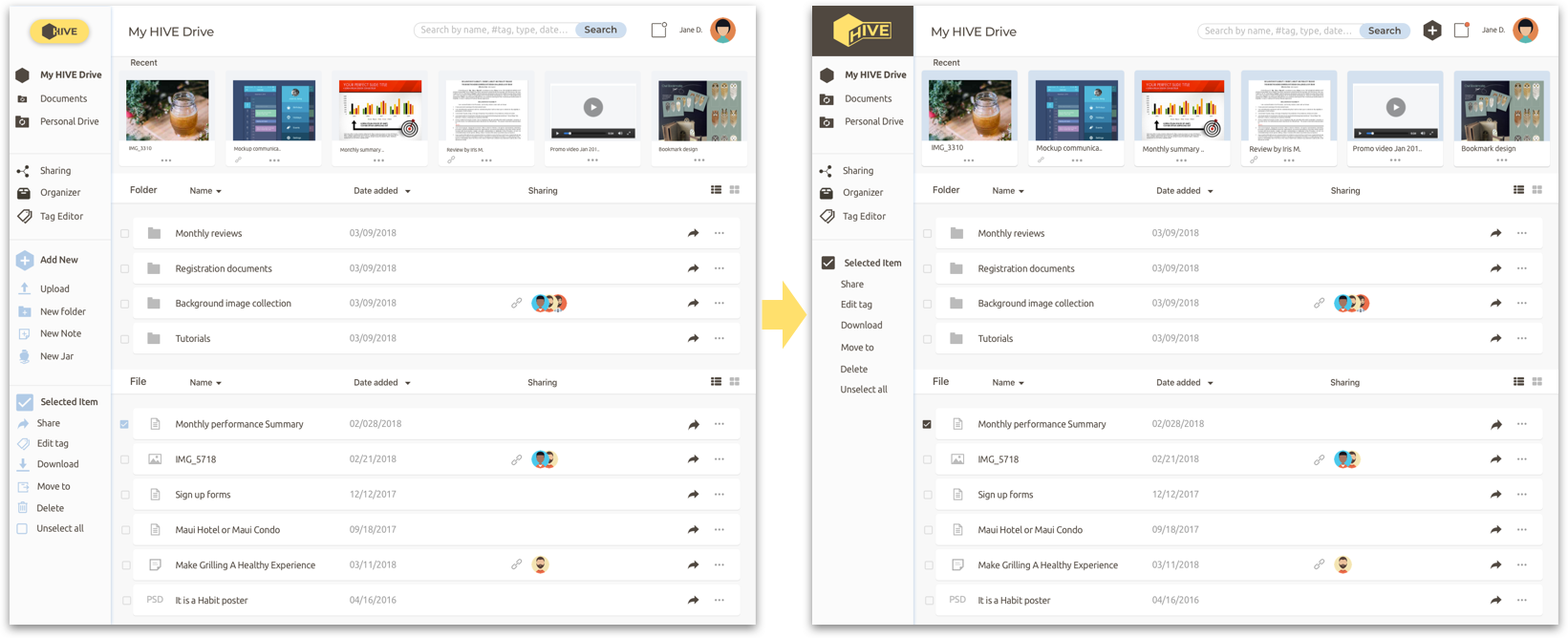 Before After
 - Finding the Drawer tool in the Note editing screen took most users a long time.
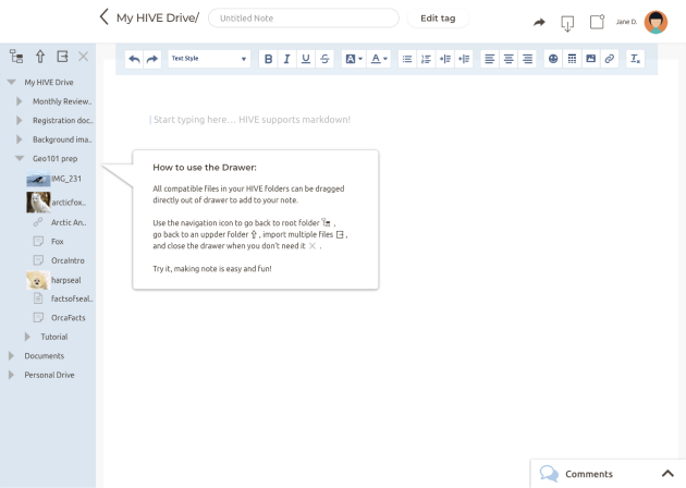
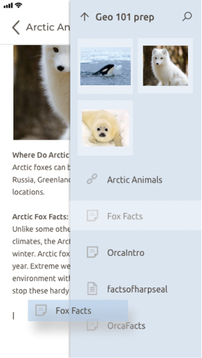
For the ones that located it, they commented that “If it was not for the hint, I will never find it.” It was apparent that neither the Drawer itself nor the hint was able to attract users attention. To improve on that, I decided to keep Drawer open as its default status. Include instructions on how to user the Drawer in the hint to make it more useful for first-time users.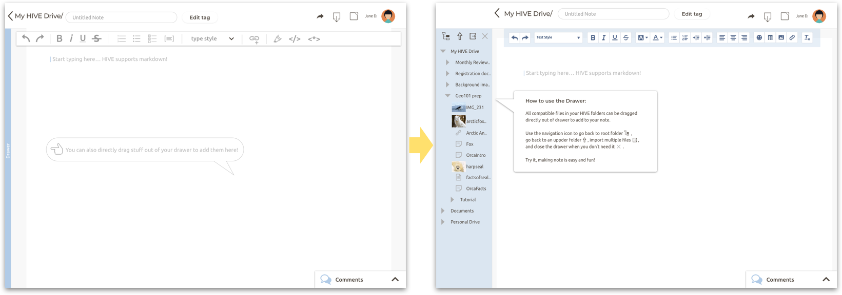 Before After
 - Usability of the Jar tool can be improved.
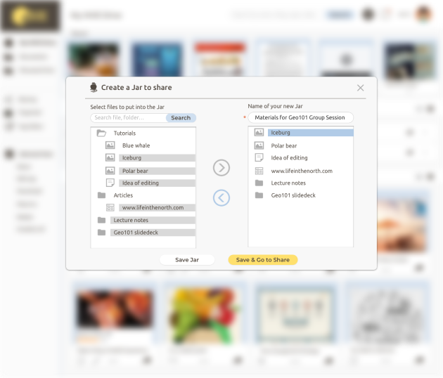
Most users showed interests in the way of sharing multiple things in the Jar tool, and considered the task easy to complete. However, they raised questions of the scalability, being that the box for users to locate items had a layered structure and it will get very hard to navigate once the layers of folder increased. It inspired me to include a search bar, which takes the full advantage of the smart tag feature of the product and further simplifies the sharing process.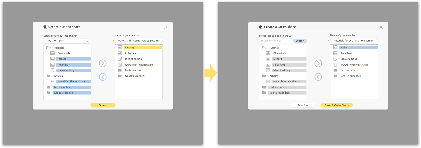 Before After
final mockups
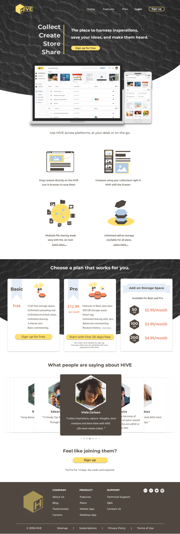

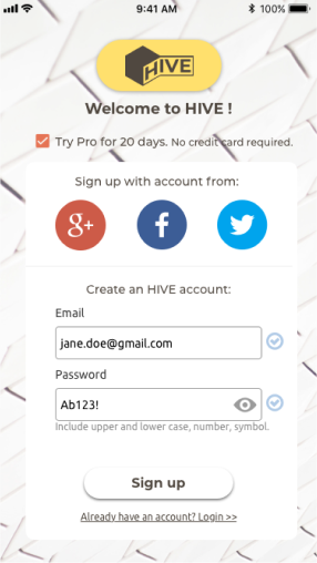
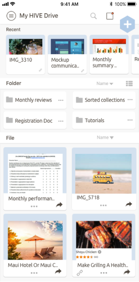
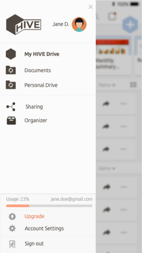
- conclusion -
It was a rewarding journey from the initial exploring to prototyping the final product.
Although there are a lot of great products out there that have excellent features and a large user base, there is always room for improvement by discovering user’s needs and pains. In the last round of the usability testing, users liked the idea of HIVE being a handy tool for collecting and creating content. Some said they would like to use it with family and friends for sharing recipes, planning trips or organizing events.
More things to do
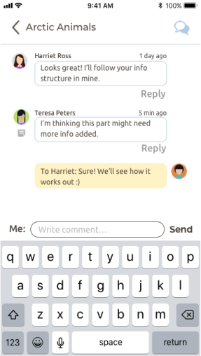
However HIVE is far from being perfect, for example, I would like to collect more survey results and conduct more user testing for each round of iteration, a task-based tutorial will be useful to introduce the unique features to first-time users, the commenting feature could be mocked up in further detail for more user testing on the flow.
key learnings
As the project grew, I learned a lot through the process and became a better designer in many areas. And as the product itself, there is always room for improvement. Here is a short list of the key reflections to keep in mind in the next project.
- Having an unbiased sample pool is crucial for product positioning and determining the trend of user needs.
- Consistency is crucial.
Keeping consistent in all types of elements across the application is important not only for branding and pleasant visuals, but also for a fluent navigation no matter what platform users are on. - Iteration is more effective when changes are made based on the patterns in user feedback.
People have different opinions on a design, sometimes they can be quite strong too. Ask, observe, write them down, pool everything together before letting the eager of correcting for negative feedback take control.
